

Swiggy donation campaign
Swiggy donation campaign
Thoughts on Swiggy Hunger Savior Covid Relief Fund

My love for emails is pretty obvious. Don’t worry I won’t bore you with a personal story (I keep those for my weekend newsletters) So I keep cleaning my inbox quite regularly.
In my recent post, I shared why I think Email Marketing is not dead. I touched briefly about Swiggy’s Email Marketing.
I read almost all the emails from Swiggy because I want to see what they have to offer to me (Though I don’t order food anymore). The content still adds value in my life and it is not spammy.

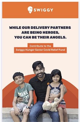
Recently I received an email from Swiggy with a subject: “Your set of angel wings await you, Prasant!” Now I don’t remember when someone called me an angel so thank you Swiggy. The email was about the donation campaign that the brand has been running. The title makes it very clear why Swiggy considers me as an angel - “While our delivery partners are being heroes, you can be their angels.” Full marks to that copy.
I made a donation to the Swiggy Hunger Savior COVID Relief Fund(Donation Link). While I made the donation, my digital consultant mind was active and I had few observations about Swiggy’s donation campaign. So here are my thoughts along with my donation journey.
Swiggy’s mobile donation journey
Opened the email on the mobile Gmail app
Donation Link from the email leads to Swiggy mobile app
And finally, the donation happens on the app with Razorpay, payment gateway
Email about the donation campaign
As told before the email is about Swiggy’s donation campaign. The email is basically a well-designed template. The visuals and copy are effective, and tell me about the campaign, how the money will be used, how much the campaign has collected so far, and the donation link with the text “You have my support”.
Swiggy does a perfect job with the visuals, copy, and has a strong value proposition. However, I ask myself what if Swiggy had a simple plain text email instead of a well-designed email template. Maybe I am still a subscriber, not a donor and the information is extensive. So the well-designed template wins the debate but one can always do an A/B testing and see what difference it makes.
Read: A/B Testing Guide for Non-Profits
Donation experience
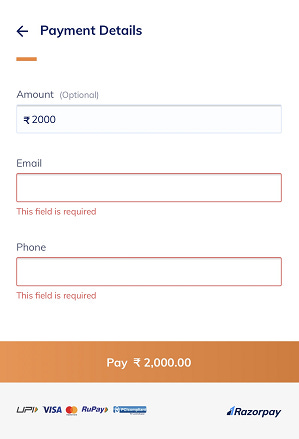
Once you click the donation link - you are taken to the online donation page on the Swiggy mobile app so you again click on the donate button and your lead to another page with more details about the campaign. Once more you click the donate button and you land to the donation page where you enter your name, email id, and phone. Once you have entered all the mandatory data you are served by Razorpay.
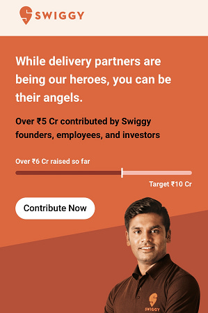
If you read the mail on mobile, the donate link button takes you to the Swiggy Mobile App. Since I already have it installed the page opens automatically but I am wondering if you don’t have the app then it will ask for you to download. Besides when I opened the email from my tablet, the donation link first went to the app store, threw a message saying link not found but on its own redirected itself to a donation portal. The question here I ask what is the business objective - to raise money or to increase app installs?
The donation process has too many barriers. Why can’t the email just take me straight to the payment gateway? The email has already told me enough about the campaign, now I am motivated to donate so why create more barriers and make me change my mind. Facebook fundraising happens in three simple steps and it is bliss.
The majority of donation dropouts happen because of the unnecessary frictions we create on the donation pages.
Read: How can you make Donation Pages effective
One good thing is that the data collection of Swiggy is minimal( no first name, last name, and prove that you are not a robot). But why is Swiggy asking my email id again ?? Besides, why does it need my phone number? I gave the wrong number because it was mandatory. And why isn’t there an option for being anonymous?
40% of nonprofits require non-essential information to complete a donation, 55% had distracting links on their page, and 30% had 3 or more steps to complete a donation. These are all contributing factors to donors abandoning their gifts, says The State of Donation Pages report by NextAfter.
Payment and follow up experience
The payment experience was smooth. Once I paid via UPI, I got a message from Razorpay about the transaction along with a transaction id. That was a boring end to my donation excitement. There was no thank you from Swiggy while I was sitting on their app. Once the donation was done, Razorpay sent me an email with the details about the transaction.
I am still waiting for a thank you email from Swiggy since I am an angel that made a small donation for their campaign. I understand Swiggy isn’t a Nonprofit organization to cultivate the donor relationship but a simple thank you could have made my experience much more exciting.
However, whether you are a Nonprofit organization or not a simple automate thank you won’t be costing you much. Maybe I will receive an email from Swiggy in a day or two, hope so.
95% of nonprofits had a confirmation page, and 97% of nonprofits thanked the donor. But some didn’t say very much or lead us forward after the donation. They said something like, “Thank you for giving with us,” or “You are a partner in our work.” That’s it. 36% didn’t note the gift amount, and 46% didn’t have any value or impact-oriented language.
Good donation pages should facilitate a good conversation. The most popular is having Social Share buttons. Maybe Swiggy isn’t interested in one. No harm but don’t overlook it because people love to showcase how generous they are and doing their bit in such tough times.
Do you have a point to make on the donation campaign by Swiggy? Just reply to this email and I will make a point to read it.
P.S. Did the article give value to your time? If yes then can you please donate to my ongoing fundraising campaign for COVID-19. Donation Link. If no, come on I am trying hard. Thank You!